Today's guest blog post is by one of our UI designers, Ahren. Ahren recently experienced a world of frustration trying to use a self-checkout kiosk. What should be a simple interaction turned out to be unnecessarily frustrating due to some small, but major, problems. So I asked him to write about it.

Good design is intuitive and gets out of our way. Bad design makes simple tasks overly complicated, frustrating and wastes valuable time. I experienced this recently and wanted to write about it, to discuss what happens when systems are engineered without a solid focus on simple design best practices.
Single Serve UIs have a unique mission
Everything has a screen now, so UIs are everywhere. We've likely all interacted with bad UIs, which leads to a frustrating experience as we try to finish up the task we have set out to do. I'd argue that buying groceries shouldn't be a complicated task.
Recently, I was using a self-service checkout and I noticed that the design had been updated. Sadly, the update was a design regression. I used to know exactly how to use the kiosk I was now staring at and trying to figure out, which generally hadn't been a problem until now.

Red never means forward
I noted two major problems immediately:
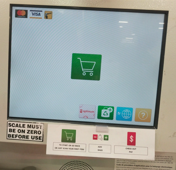
- They had tried to replace every label with an icon. While that can sometimes work, on a UI that must be identified and understood quickly, this was a huge issue of form over function. The kiosk had functionality that could not be explained through an icon and I was left bumbling, pressing things just to see what they did.
- When I navigated to the main screen, which is likely the most-utilized screen, I noticed that not all of the colors follow standard design principles. A button to navigate out of a menu was green, whereas a button to continue on with the purchase was red. Most people wouldn't see red and think, "there's my path forward". Red usually means stop, not go forward.
Here they use a red ‘$’ for checkout, and also trigger you back to the main screen after the first press, making it seem like it isn't the way to go to a checkout.
The UI should not need a legend
Note in the photos that they added a paper legend to the bottom of the kiosks to help users out. A well-designed UI doesn't need a legend.
As a UI designer, I get frustrated that problems like these exist, especially in systems from large corporations with resources. And definitely at a kiosk whose main objective is to make checkout efficient. A designer would have easily been able to point out these fundamental problems and carry out some UI/UX research, therefore never allowing these problems to end up in a live deployment.
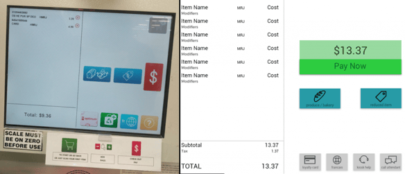
An embedded team with a designer on board would pull from a number of knowledge resources to ensure that the UI is easy-to-use, intuitive, and following well-researched design best practices. For example, Google has Material Design, Microsoft user Fluent (Metro), and Apple has what they call Human Interface Guidelines. While utilizing resources like these might not fix all of the problems, it is a good place to start when designing these single-serve UIs. I quickly mocked up a simple UI below in response to some of my frustrations over the design deficiencies. While it isn't an exciting overhaul, it took very little time and it works, because it follows common design practices. In a future post, I'll delve further into the design process for single-serve UIs.
.png?width=180&height=67&name=Crank-AMETEK-HZ-Rev%20(4).png)


