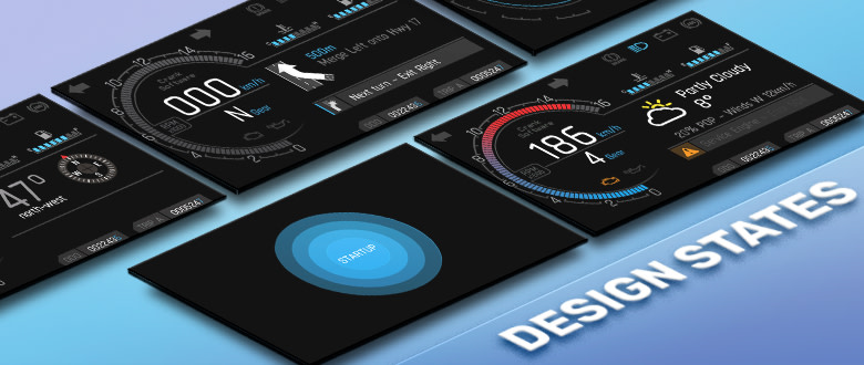
When you run an embedded application, screens are dynamic and change in response to data and animations. However, you can't see those dynamics during design time, so you're left with blank screens until you simulate or test the application on a device. If you've ever had to work with content that you could not see by default during the design process, you probably had to make that content visible while working with it, and then return it to its invisible state when finished. This workaround is cumbersome and prone to user error.
In this post, we’ll tackle the challenge of designing content that reacts to changes at runtime, the problem with the traditional workflow, and a better way to visualize content throughout its modalities.
Challenges with working with dynamic content at design time
Traditionally, this has been the workflow:
- Toggle the visibility of the layer (and all those that are obscuring it)
- Work with the content on the layer to make desired changes
- Restore the visibility of all the changed layers
This workaround is error-prone because all it takes is forgetting to restore the visibility of a single element to leave things in a bad state. Also, it's tedious and time-consuming because these additional steps aren't providing any additional feedback to the developer when they restore the layers.
Check out the following video to learn about a better solution to working with dynamic content and making it faster and easier to build up your GUI screens.
Recently, we released Storyboard 6.0 and introduced the Design States feature to give developers the ability to work with model elements that they cannot see by default. Design States are a lightweight collection of variable changes, named data changes, and animations which render a screen into a particular visual state.
Design States - a smarter way to work with dynamic content
Design States allow you to dedicate a Design State for editing a hidden layer.
Using the Design States functionality, here is the workflow:
- Create a Design State for working with this Layer
- In 'Context State', toggle the visibility of the layer (and all those that are obscuring it)
- Switch to 'Master Context' and work with the content on the layer to make the desired changes
- Remove the Design State, or Keep it to visualize the hidden layer or for future content editing of the layer
In 'State Context,' these visibility changes are specific to the Design State and don't affect other Screens/States. You can toggle the context to 'Master Context,' and your changes affect the model globally (and not only the Design State). The effect of this workflow is that the only actual changes to the model are those that you want, and you don't have to make temporary changes to the model for editing purposes or remember to revert them.
Run your animations from any state during design time
Design States also give you the ability to define a starting position for an animation. This is helpful when previewing animations in the Animation Preview tool. For example, if you are working with an 'open menu' animation and a 'close menu' animation and by default, the screen has the menu closed, then we would not be able to preview the 'close menu' animation using the Animation Preview tool. Using Design States, we can specify that we want to run our animation from a particular state. In this case, we would create a Design State from the 'open menu' animation, and we would use this state as the starting point for our 'close menu' animation preview. Cool, right!?
Design States are a great way to communicate the various ways that a Screen might look throughout an application's life, at design time. Now, a screen that appears visually blank at design time can also demonstrate the various ways that it might look at runtime by using Design States, making the design process faster, easier, and less prone to error.
.png?width=180&height=67&name=Crank-AMETEK-HZ-Rev%20(4).png)

