With the smart home/smart appliances market continually growing year-over-year, there are aspects that need fine-tuning and speculation over which devices and systems will gain popularity. While product manufacturers have challenges like connectivity and cybersecurity issues to overcome, smart home technologies still offer tremendous economic gains if you know where and how best to seize them.
For smart home appliances to be readily adopted by all generations, their ability to provide hassle-free interactions is paramount, or else consumers will shy away from them and be on the lookout for alternate, easier devices. So, if you're planning on creating a new smart device, it is important to include an uncomplicated, yet visually appealing user interface (UI) that provides users with an effortless user experience (UX).
Why do you need to focus on the UI/UX of your Smart Device?
UX is a critical part of developing any kind of product that has a UI, including smart devices. Customers expect their devices to not only be aesthetically pleasing but have a UX that is attractive, informative, and straightforward to operate.
Products need an elegant and interactive user interface, much like websites and mobile applications. Users need to be able to navigate through the screen without any confusion, errors, or delays. Another important aspect that needs to also be considered is that the product will be operated by all types of users, including non-technical people. So, you must provide users with an intuitive UX so they can fully enjoy your product.
The end goal of UI/UX product development
The goal of your user interface should be to ensure that the user's interactions with the device are simple, intuitive, and satisfying. An appealing and intuitive user interface having a great interface helps your product stand out from others and win market shares. Leaders strive to improve design capabilities by keeping in mind the user behaviours which are difficult to describe to improve customer satisfaction.
This is why you should always take an analytical approach to UI design to unlock the value of your product.
High-usability designs take users through the easiest and least time-consuming paths. Users should be able to find their way around an interface easily enough to achieve objectives without requiring expert assistance. So, it would be best to leverage a deep understanding of users' contexts. This requires you to cater to their limitations, which include their environment, potential distractions, and cognitive load.
As per Imaginovation Insider here are some use cases for not-so-good UX:
- Confusing to use where it's difficult for a user to navigate
- Inaccessible in terms of added features as users find it hard to understand
- Inefficiency, as in longer time required to perform a particular operation.
For your business case to be persuasive, you need a clear understanding of hard statistics when explaining to others the importance of UX. Here are a few statistics which will give you a clearer idea and shows the results of having a not-so-good UX in your product.
The pain points to create a great user experience:
- Improved accessibility, enabling users with disabilities to perceive, understand, navigate, and interact easily
- Easy-to-perform product features
- Provide users with a more engaging experience and so that they feel more connected to the product
Building a product that encompasses all these qualities embraces users as these products bring customer satisfaction. Boosts brand advocacy as interactive UI/UX keeps users hooked, and more people tend to like the product. This further leads to more products being consumed in the market and increases the return on investment (ROI) over establishing your brand reputation.
Check out this article by Erik Kennedy to learn additional tips on improving the UX of your product’s UI.
Potential pitfalls encountered while building embedded products
Lack of project team coordination: Lack of coordination, or even collaboration, between designers and embedded developers. After the initial design of the UI is complete, the handoff to developers occurs. However, if there is no coordination or collaboration between the two teams some part of the UI may be missed or simply altered during development resulting in the end UI not matching the envisioned one.
- Making UI changes without impacting development: Introducing iterations to the UI/UX design can be challenging when working on embedded software. Typically, most changes result in past development work being lost or needing to be recorded to be functional once again. This not only consumes more of the embedded developer's time, as they may need to redo things to keep up with the functionality but also introduce more cost and delays to the overall project.
- Low energy with long-term performance: Low energy consumption with long-term stable performance (with low maintenance) has always been the end goal when designing devices that are battery-powered. Therefore, when it comes to UI development, the key is developing everything discussed so far but in a manner that does not cause the UI app to consume too much power. Hence having the ability to seamlessly switch between 2D & 3D GPUs can be a game changer.
- Getting to market on time: Getting the designed, developed, testing, and out the door on time can always be a challenge in embedded development, especially during global supply chain issues. That is why developing a UI application that is flexible to changes in design is essential to keeping development moving forward in some manner while other issues are being overcome. In addition, considering how long a lifespan is for an embedded device, easily addressing future updates and releases becomes an important factor in development.
How Storyboard helps overcome these development challenges:
Built to provide a collaborative development environment, Storyboard allows development, testing, and implementation of the recommended changes (iterations) during the development process without disrupting prior progress, thus helping the project stay on track, and reducing time to market for your product. It provides a common development platform that encourages greater coordination between designers and developers. With Storyboard you can monitor your resources directly while you’re building up your embedded application, so you can be confident your performance is 100% optimized for your target hardware when it's time to launch. Its platform-agnostic development framework helps de-risks your project by providing you with a means of making technology changes at any point during the development cycle.
With it, you can add animations, including capturing movement and motions in a click with animation Record and animation timeline features resulting in elegant, smooth, and clutter-free animations. Using its unique rapid design import technology, the process of introducing design changes becomes agile, allowing products to be refined at any stage of development to exceed customer expectations and without the need to recode the entire application. Additionally, it provides engineers with a real-time display of what the final product will look like, where real-time editing of controls, layers, and screens is possible; hence, if you want to see how the UI will look, you don't need to change and recompile.
Few other elements and functionalities that are crucial to improving your product's UX
One of the most significant barriers to achieving brilliant UX is understanding how to fit all the elements and behaviours of a GUI's screen on the target board's memory. This includes image assets, animations, fonts, and the underlying hardware access times, rendering pipelines, and events framework that drive it all:
- Image format and loading assets directly affect runtime performance, as assets may need to be decoded before rendering to the display. Access times depend on whether they're stored in RAM or flash memory.
- Animations, including screen transitions, require processor resources to be composited, and performance is highly dependent on the capabilities of the display controller, whether graphics acceleration is available, and other characteristics of the hardware and software libraries.
- The font rendering process extracts data from a font file, constructs an image at runtime, and pushes the result to the screen.
Internationally ranked #4 top direct-selling company in the world, Vorwerk chose Crank Storyboard as their embedded UI software platform.
Since consumers are accustomed to enjoying mobile phone experiences daily, their expectations for kitchen design and appliances are proliferating. Consumers expect their home product displays to be just as dazzling as their mobile experiences. In addition to displaying vibrant colours and stunning images, these displays should also be able to display animations in 2D or 3D.
But is it possible for embedded smart home appliance manufacturers to provide these anticipated user experiences in their products?
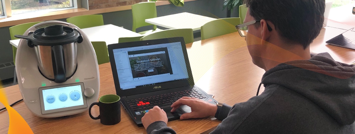
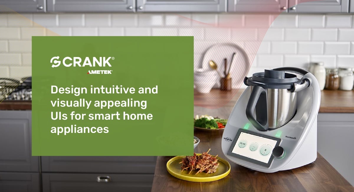
With a stainless-steel bowl, state-of-the-art blade, precision heating element, and an embedded scale, the Thermomix TM6 unites more than 20 different appliances into one digitally powered appliance. They wanted a GUI solution that provides their customers with smooth screen transitions and excellent UI so that the customers could utilize its different functionalities. Crank's Storyboard due to its intuitive interface, scripting ability, quick adoption and flexibility, met all the requirements desired by the Vorwerk for their world-class product. Additionally, it helped them bring UI development back in-house, saving on outsourcing costs. Powered by Crank Storyboard, the Thermomix TM6 screen features a 6.8-inch, full-color touchscreen display. In addition to exploring cooking options, organizing shopping lists, and creating personalized recipe collections, the embedded touch screen supports automatic updates over WiFi.
Vorwerk achieved all this within the stipulated project deadline through a collaborative effort between their design team and the Crank's support from the professional services team and delivered a successful product Thermomix.

You have the vision, but are tight on resources – Crank Professional services team can help you realise your UI design vision
We are here to make your job easier, no matter what you're trying to create. From start-ups to Fortune 500 firms, we've worked with renowned white goods, smart home companies like Vorwerk, GE, Alliance, and Emerson Sensi and delivered successful products. From design to development, and from prototype to testing, our professional services team will work closely with yours to provide the best simple yet distinctive UI for your embedded product.
To realise your vision and discuss the solutions get in touch with our professional services team now.
.png?width=180&height=67&name=Crank-AMETEK-HZ-Rev%20(4).png)


