It may seem obvious that usability should be a top priority for medical devices. But, unfortunately, devices with poor graphical user interfaces (GUI) find their way into the market every year, posing serious risks to patients.
According to MassDevice.com: In 2000, a heavily pregnant woman was admitted to Tallahassee Memorial Hospital. To ease the discomfort of her labor, she was connected to a patient-controlled analgesia machine – a programmable infusion pump.
Just eight hours later, instead of delivering a healthy baby, she was pronounced dead from a morphine overdose.
Human error was cited as the main cause of failure, but this story points to the importance of good medical device usability and GUI design and their impact on patient safety. The pump required up to 27 steps to successfully operate. How could anyone be expected to use it safely?
Unfortunately, this tragedy was not an isolated incident. Over the next 12-year period, improper use of the same pump resulted in 65 deaths (with estimates suggesting that the number was closer to 650). That is, until the company agreed to make design modifications to the UI.
The number of medical device recalls is growing - often with user interface design to blame
The demand for graphical displays in medical devices is growing to the point where they are no longer “nice-to-have” but “must-have”. This proliferation of user interfaces also means a growing number of poorly designed interfaces and device recalls. According to a three-year study from Aston and Swansea universities, 140 medical device recalls happen on an annual basis and more than 50 percent of these recalls are traceable to GUI design.
It’s therefore extremely important for medical user interface software designers to understand usability and UX design best practices. Siemens suggests a straightforward five-step approach: strategy, focus, structure, composition, and design. But it’s equally important for designers to get feedback from users – and fast.
Good industrial design can hide a bad GUI
The medical device market is a competitive one and the need to get to market faster than the competition is an ever-present pressure. Usability testing often takes a back seat to rapid design and development, especially when the whole process is behind schedule.
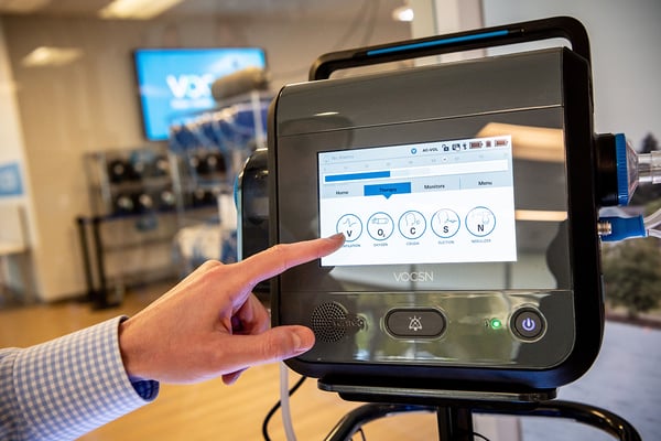
This situation is exacerbated by several shifts in the medical device market. There’s a trend toward the amalgamation of functionality into a single device and an increasing demand for rich medical user interface designs that provide a cell-phone-like experience. Another tricky situation is the user, who is often a patient themselves – especially prevalent as a growing number of treatments are outsourced to portable take-home medical devices. Yet another important issue is that good industrial design can hide a bad UI.
Fortunately, many UI software and design errors can be avoided or eliminated with two things: sufficient software testing and verification.
Usability and UX testing is a must for medical user interfaces
Usability testing is a critical step in the design and development of medical devices if we are to avoid misuse and tragedy. Real-world testing of prototype UIs can also mitigate the cost of defects by channeling user error into productive bug reports as opposed to product recalls.
Of course, designing and then validating an embedded GUI, testing it and gathering feedback, and then going back to the drawing board uses time, resources, and money. And while rapid turnaround is not always associated with medical devices, sometimes it’s necessary.
 A customer of ours, Ventec, needed to quickly alter their user interface to accommodate changes introduced by COVID-19. Their ability to rapidly iterate on their UI design and recommended UX enhancements ensured that their product delivered a highly functional experience, with patient safety being the #1 priority.
The need for both rapid design and development alongside usability and experience testing is not a trivial problem. Rather, there is a straightforward solution: the right tools.
Accelerate change and UX testing for medical user interface designs
The intersection of design and development is where a GUI comes to life. Having the right development environment that facilitates this interaction can mean the difference between a highly functional product and a failure. This is where a parallel workflow is essential – a place where product teams can collaboratively create embedded GUIs alongside one another.
What designers gain from this type of workflow is the ability to create a fully functioning mock-up of the product before development is complete. This allows them to tweak and optimize interfaces in real time on real target hardware. The result is accelerated development and a UI that adapts to meet dynamic usability requirements. On the other hand, the standard workflow of design-develop-test leaves UI designers isolated and far removed from the user testing needed to ensure a safe product.
Interactive workflow and rapid turnaround time
Not surprisingly, although usability may be life critical in embedded medical devices, a clean and usable interface is also a major factor in the acceptance and success of many other products, like factory robotics, white goods, and smart home devices. The interactive workflow and rapid turnaround time that we’ve made an essential part of Crank Storyboard is good for both. The very same UI design process that enables medical companies to rapidly build products with unambiguous interfaces for clinicians and patients is the process we recommend for all embedded devices.
While not every product has a good user interface, every product can use one.
To learn the best practices for UI design and safety in medical devices, watch this on-demand webinar from VDC Research, BlackBerry QNX, Toradex, and Crank Software.
.png?width=180&height=67&name=Crank-AMETEK-HZ-Rev%20(4).png)


