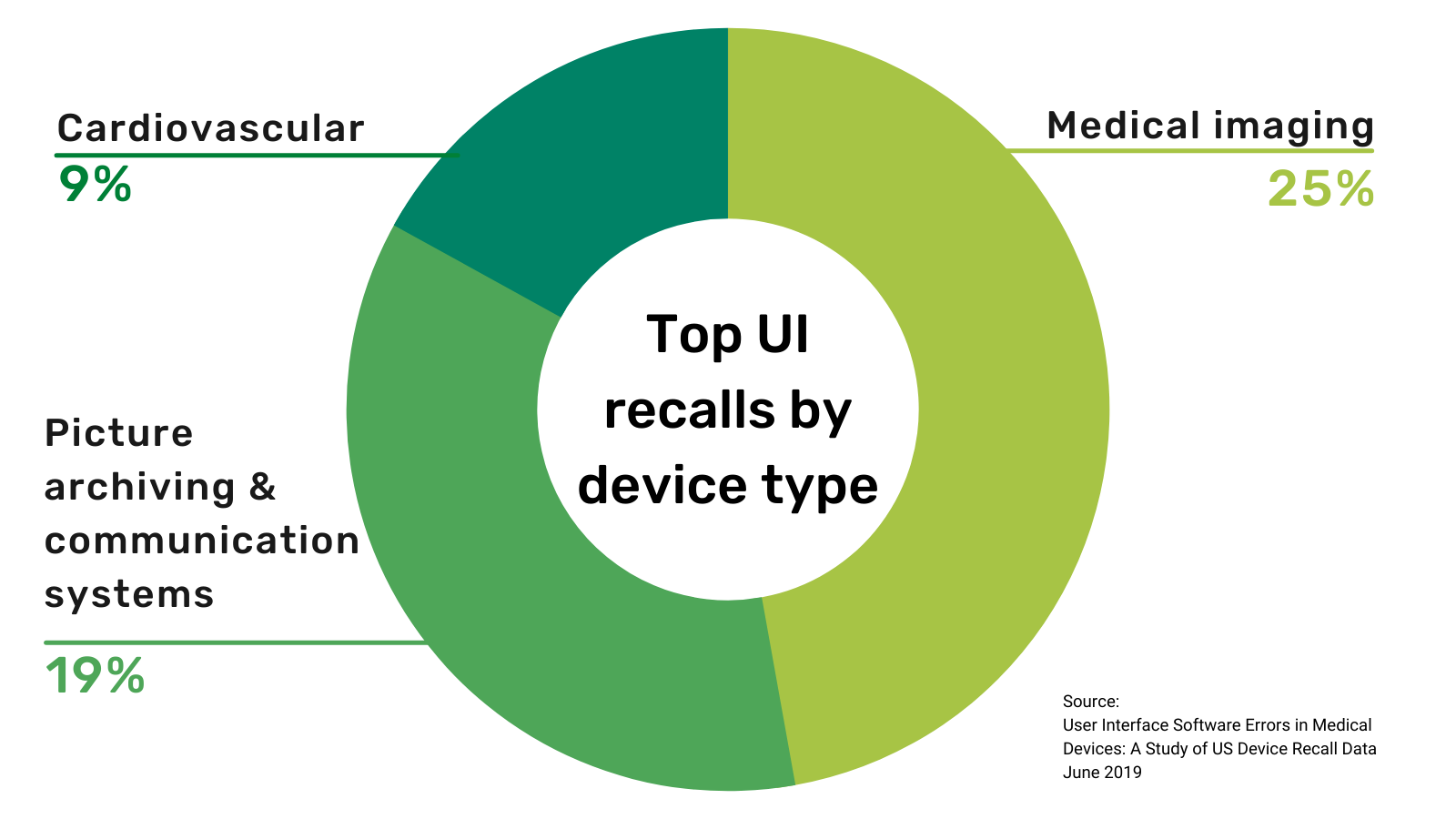
In 1990, the FDA published a report, Device Recalls: A Study of Quality Problems, that revealed 44 percent of medical device recalls were due to design issues and one-third of those were due to a faulty user interface (UI). The resulting uproar led to the US swiftly passing the Safe Medical Devices Act. This regulation has been in place for over thirty years now, so surely medical UI problems are a thing of the past, right?
Unfortunately, not. A recent study found that approximately 140 medical devices a year are still being recalled due to UI problems.
Can anything be done about it? This blog reviews the top factors that cause medical UI problems and looks at specific recommendations that embedded GUI software teams can use to build next-gen medical devices that are safe and usable.
Medical market pressures
Three new forces are acting on medical software development processes, and they can interact in ways that lead to poor medical user interface design.
Competition. The competition among medical device makers is fierce – there are more than 6,500 medical device companies in the US. When there are a lot of companies chasing after the same opportunities, manufacturers naturally feel a downward pressure on time to market for development of new products. One study found that on average, a medical company felt they needed to cut their development time by 25 percent to remain competitive.
Complexity. While executives are slashing development timelines, the reality is that medical software is getting more complex and harder to create. This can be observed by the dramatic rise in the length of paperwork submitted to the FDA regarding the development of medical devices. Over a 25-year period, the page count on an average FDA filing has grown by over 600%, in turn leading to longer clearance periods as regulators try to determine approval of the device.
Attractiveness. The third pressure is the iPhone effect. Modern medical devices need an attractive, smartphone-like GUI to compete effectively. Nowhere is this more apparent than in the explosion of home healthcare, where average individuals use medical products instead of trained technicians. But attractiveness and usability are factors for clinical settings too. Our medical clients tell us that once a medical device’s functional requirements are met, significant sales to a health care network can be won or lost depending on a product’s look and feel. While sloppy interface design can lead to the erroneous dispensing of medication and even death, dated displays also impact business opportunities.
Unfortunately, faster product timelines, longer development cycles, and more sophisticated GUIs lead to product development cycles without enough time for adequate usability testing and GUI iterations.
The human factors behind medical devices
How do we improve medical user interface designs? One big question is whether or not development teams are taking proper advantage of the existing knowledge on proper human factor engineering. There’s a lot of material out there on this; here are some of our favorite resources.
- An Introduction to Human Factors in Medical Devices
- Understanding FDA Regulatory Requirements for Human Factors Usability Testing
- Balancing Aesthetics and Usability in Medical User Interface Design: 9 Key Trends
- Webinar on UI Design and Safety in Medical Devices
- IEC 62366-1:2015: Application of usability engineering to medical devices
- ANSI/AAMI HE75:2009: Human Factors Engineering - Design of Medical Devices
- 2010 ADA Standards for Accessible Design
Most of these resources give some guidance but few are completely prescriptive. It’s expected that the majority of design principles are executed within the context of properly conducted usability studies. With shrinking schedules and increasing complexity, fitting even one iteration of usability testing into a development timeline, let alone several, may seem impossible. Perhaps the bigger question is, if usability testing is so crucial, how do medical teams find enough time to conduct them?
The right process and architecture
A standard development process usually has to wait until hardware design, prototyping boards, operating systems, and all other supporting components are reasonably stable before the GUI can be tested. Given shorter timeframes, it’s easy to see that this will lead to issues. Any time for GUI development, refinement, and usability testing is squeezed into the last weeks before release. That makes it significantly more likely that the pressure to ship will override the need to root out any remaining GUI deficiencies.
What is the ideal way to design a medical GUI that is both stable and intuitive? The key realization is that GUI development must start as soon as the product requirements are solidified, even if the hardware isn’t ready yet. This ensures enough time can be dedicated to working out usability kinks. If developers can discover GUI issues early, they have time to correct any problems where users misinterpret data, mistakenly enter wrong numbers, accept bad default configurations, ignore critical warnings, or are led down incorrect assumptions.
Here are the three essential GUI architectural guidelines you need to know to decouple the GUI from the rest of development:
- Platform agnostic – isolate the GUI components of the application away from hardware as much as possible. Also choose development tools, like Storyboard, to run the UI on a laptop, tablet, or reference board, allowing usability tests in a simulated environment to happen in parallel with hardware development.
- Model view controller (MVC) – a best practice development pattern, MVC architectures separate the data from the GUI and centralize any code that connects the two; if any part of the system changes, the effect on the code is minimal.
- Event driven – another software engineering paradigm, event-driven programming keeps the actions of the GUI isolated from the functional logic of the system. This separation also allows the framework to inject events, allowing the GUI to simulate the hardware and be programmatically tested.
Most experienced developers would agree that their projects should adhere to these principles, but the best laid plans often go awry. By project’s end, any lofty goals that would keep a GUI insulated from the rest of a system have been abandoned. As a way of expediting the development process, prototyping experiments become production code and business logic creeps into the GUI. These easy-to-overlook deviations occur by small amounts over time, but the end result is that the GUI becomes dependent on underlying functionality. That dependency causes the GUI to be brittle – it cannot be easily changed without breaking the product.
Resetting the medical UI design thought process
User interface brittleness occurs unless developers exercise extreme discipline when making software changes. At least, this is true when the GUI shares the same language and tools as the rest of the device’s functionality. In other words, if the product’s main logic and the GUI framework are both written in C++, programmers who introduce changes must decide exactly what and where each change resides since their code could conceivably go in either place. A small fix that logically belongs in the device’s underlying functionality may be easier to implement in the GUI. But once that fix is in the GUI, it’s very hard to find the time to go back and fix it properly.
However, if GUI architecture guidelines are being followed (that is, being platform agnostic, using the MVC pattern, and using an event-driven GUI), there’s no inherent benefit to having the GUI and mainstream development share the same language and framework. A key realization is that if the GUI and logic use different frameworks and languages, it will subtly pressure developers to continually reinforce the architectural guidelines that keep the GUI flexible and adaptable.
Giving usability enough time to succeed
The forced separation of GUI and business logic is in fact, one of the key architectural decisions behind our Storyboard product. By strictly decoupling the GUI and the logic, prototyping and usability testing of medical equipment interface designs can occur in parallel within the main development path, even before hardware decisions are finalized. With an event-driven architecture, a consumer-grade tablet can be used to test the GUI with scripts to generate events simulating real device behavior. And changes to the user interface can be made freely without the fear of breaking device functionality. This lets medical development teams fix usability problems before they cause recalls – or worse.
Dive deeper into how embedded teams improve medical user interface design in this webinar with BlackBerry QNX, Toradex, and Crank:
.png?width=180&height=67&name=Crank-AMETEK-HZ-Rev%20(4).png)


