What the future of connected, IoT smart devices looks like for embedded systems built with NXP processors and Storyboard GUI development tools.
Rapidly changing technology has a way of sneaking up on us, and if we aren’t prepared to take advantage of those changes, companies will be left behind. This truth is becoming evident in the world of embedded graphics and IoT. The latter is constantly driving the demand for higher performance and lower power processors, with rich graphics as a cornerstone of an exceptional user experience.
In this post, Rob Cosaro, IoT technology officer at NXP, together with Jason Clarke, co-founder and VP Sales and Marketing at Crank look at the evolving tends in computing, the next wave of IoT and AI led computing, the challenges and opportunities ahead with IoT devices from a hardware, graphics and user experience perspective.
Don't have time to read and would rather listen/watch the presentation? We get it. Watch it here.
The 5th wave of computing: AI & IoT
with Rob Cosaro, IoT Technology Officer, NXP
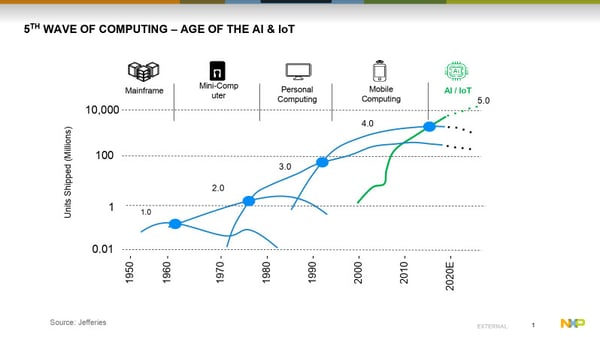 Right now, we're going through what we call the fifth wave of computing. Phase one was mainframes, and it went from mainframes to mini computers. Wave three is the personal computers and then mobile computing now. We're existing in that mobile computing and personal computing phase, but rapidly approaching the more volume, AI and IoT market. We call it the age of IoT - where everything is connected. In this fifth wave, there's a lot of things that are connected to the internet.
At NXP, we're seeing the next trend where there are more devices connected, but connected to a bigger device and that device is smarter. We're calling this next big trend, The Empowered Edge.
Coming soon: the 6th wave of computing
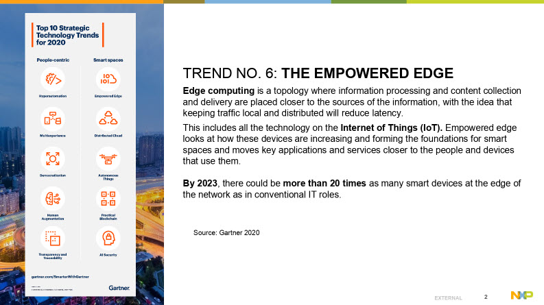
It's collecting data from those edge nodes to this empowered edge, which then gets broadcast out to the cloud. The reason why we care is because if we have this more empowered edge, it reduces latency, improves performance, and just has a better experience in general. We divide the edge or the IoT Intelligence Pyramid into three different categories:
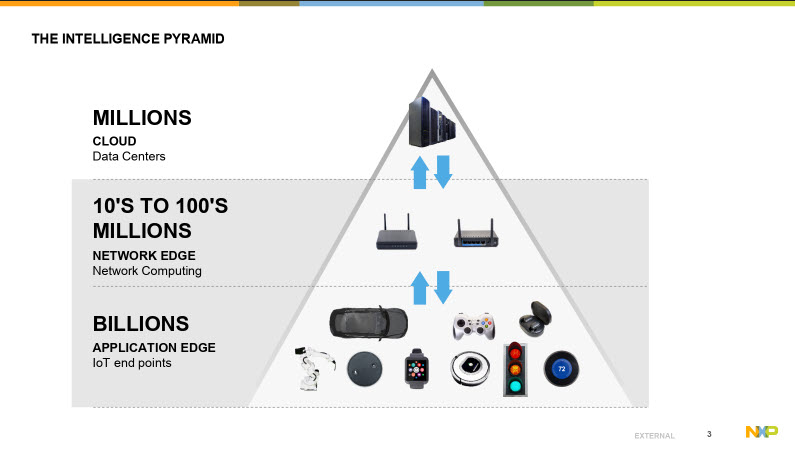
- There's the cloud data servers that everybody knows about.
- Then the network edge which is that smart devices that fit in your home collecting data from smaller devices, and the
- Billions of IoT endpoints which is the remaining application edge.
These IoT endpoints are the ones that have the embedded graphics. They'll have more with which the user can interact and more for the user to see. At NXP, this is where we're concentrating our efforts - towards rich graphics and better devices that have higher performance.
At NXP, there are four different markets within IoT that we're addressing:
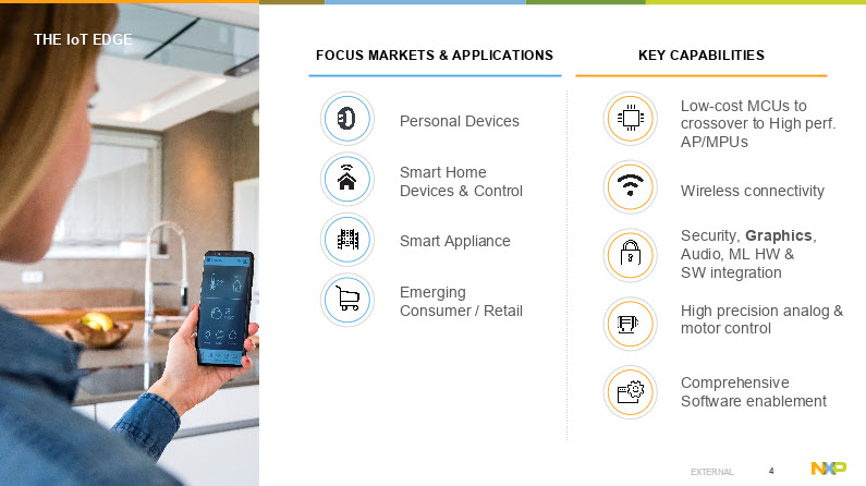
- Personal devices
- Smart home devices that control your home
- Smart appliances (this can be just about anything that you can think of as far as motors and industrial applications, from washing machines to other type of applications)
- Emerging and consumer retail spaces where we get tracking of packages and tracking of what you bought in the store.
Smart device battery capacity - pushing the low power limits
There's a lot of new ideas emerging there. From delivery drones dropping packages off your house or little drones driving down the sidewalk. These devices all require more horsepower, and have more capabilities than there was in the past.
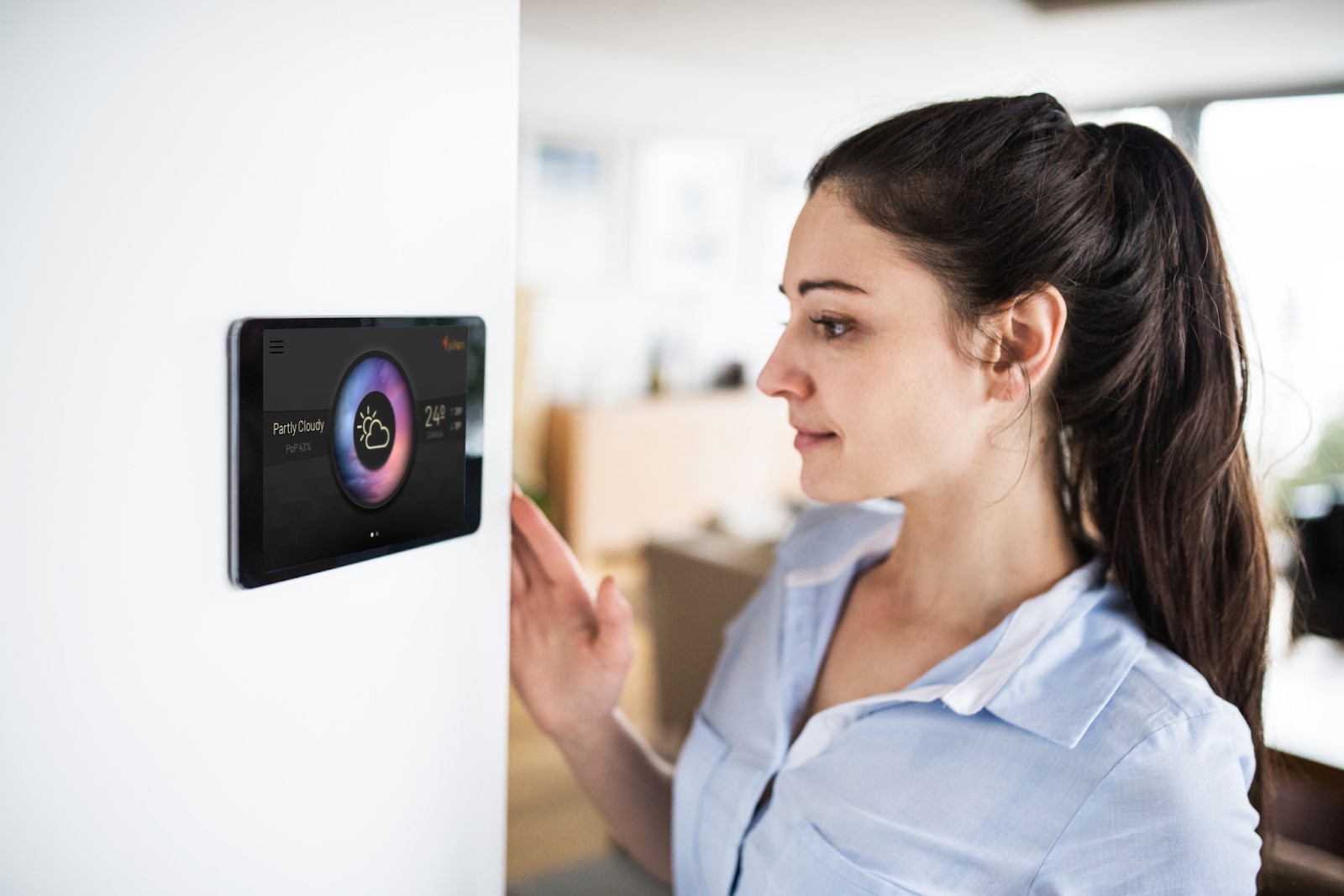
If you look in your house, there's a myriad of things that are becoming smart: from smart thermostats to doorbell to door locks, smart speakers, the Amazon Echoe, and all the different Google devices that you can talk to now. Smart thermostats can understand if you're home or not. They can set the temperature accordingly to what's going on in the home. You can see what's happening if you have a remote home. You can see what's happening in that house. Lights can be turned off and on remotely. Just from this picture alone, you can see there's a huge amount of things that are becoming connected to the internet.
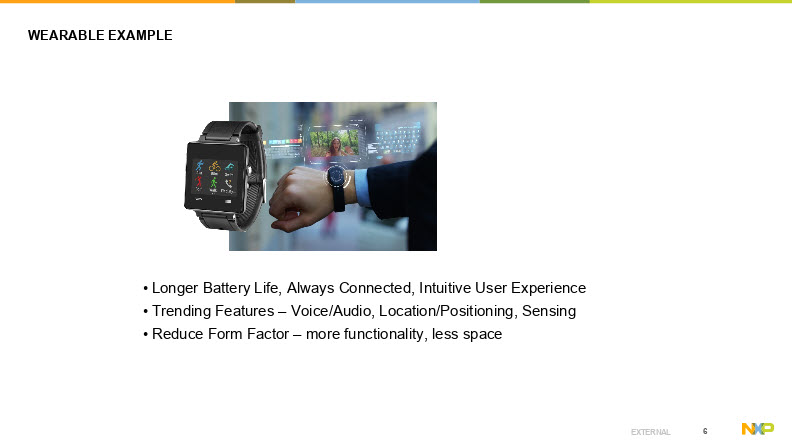
Wearable devices are another great example of devices that are internet-connected. There is ever increasing demand for smartwatches from Apple watches, Garmin watches, Polar watches that collect data, transmit to the internet, did I run today, did I bike today, how long did I exercise, trying to get people having a better experience with their daily activities.
Consumer expectations of battery life for smartwatches
The clear trend here is a need for longer battery life. Nobody wants to charge their watch every day. Consumers want to be able to have at least five days of battery today - that seems to be a comfortable limit. There are manufacturers making these things now, and you want to be able to have smaller form factors. That's really pushing very low power devices in this space, and also it's pushing low power not just to wearables, but into other devices that are always connected as well. Think about Amazon Echo. It sits in your house. It draws about three watts all the time, and we want to reduce that power to less than a few milliwatts, and that's happening in the future.
What IoT trends are silicon manufacturers reporting?
Density is still increasing. We're seeing deep submicron processes going from in just a few short years ago from 16 nanometers now to seven nanometers, then down to five. I know that some devices have announced in the next few months that are in this five nanometer node.
Also, non-volatile memory is shrinking. It's not as fast as a logic-only process is, but now NXP is producing floating gate flash in 40 nanometer. In my opinion, I think 40 nanometer is probably the last node for a floating gate.
![]()
I know there are some companies working on 28nm, but other technologies are starting to come on board that have better characteristics, like MRAM and RRAM. Those devices can contribute a symmetrical operation, where you can have both reads and writes symmetric. You don't have to worry about the idea of vectors or pages and page arrays. Now you can just read and write directly to those memories.
TREND: Non-volatile memory now readily available for more graphical assets
Those have a huge impact or will have a big impact on graphics because once we can have larger non-volatile memories in devices, it allows graphics assets to be more readily available. From this bottom line, you can see this picture. You can see that, yeah, these processors from Apple, this is Apple silicon is getting denser, but the size hasn't changed. They seem to be stuck around 100 square millimeters or so now.
TREND: Devices are doing more, in a smaller space
These devices are getting more and more complex, doing more and more things. The graphics on an iPhone today, compared to what it did in the past, are amazingly different. This trend is happening in general purpose microcontrollers as well, and I wanted to contrast that picture from what you saw earlier, what Apple's doing to what we're doing with our processors.
NXP has LPC parts now in 40 nanometer flash. We didn't reduce those in 2019, and we introduced just recently RT600, RT500 and RT1170 in a 28-nanometer node.
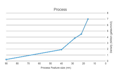 Those products are allowing us to do a lot more in a smaller space. Look at the chart to the right, that shows the feature size of the process and the density as far as million gates per square millimeter. In a 28-nanometer node now, an M33 is about 0.1 to 0.2 square millimeters. That's nothing, it pales in comparison with the memory sizes.
What's happening is the densities are increasing. We're adding more and more complex IP into these parts, and when it comes to graphics, that's also happening. We need partners like Crank and their embedded GUI software, Storyboard, to take advantage of all that silicon we're adding. We're getting more and more hardware, and the embedded graphics are getting better and better.
What do silicon IoT device trends mean for embedded graphics?
Back in 1999, our graphics were considered character-based LCD. That was really cool back then, and then that moved to RGB panels, QVGA or so. They use simple display controllers. We used one from ARM PL110 and the PL111, we thought that was really complex and very cool very, very state of the art. It allowed you to raster out of memory, and we could produce pretty cool graphics with it. The NXP PL111 was the latest update that we did back in 2000. Now we're adding GPUs with complex display controllers that support different interfaces like MIPI, MIPI DSI and MIPI DVI.
![]()
The complexity of graphics now available to us on embedded systems and controllers is almost equivalent to what you can see on an iPhone. It's amazing to see the differences from just a few short years, and process is driving all that.
What does the hardware look like?
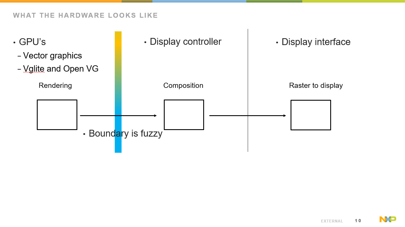
In the broader embedded space, vector graphical processing unit GPUs are available, supporting both VGLite and OpenVG - both of which are used for rendering. Sometimes for composition, the boundaries are blurred there.
We also have display controllers that can also do compositioning, and it really depends on your point of view on what you consider a display controller. Essentially it is something that can take an image, modify it, raster it, and give it to the display interface, all of which is part of the composition process, where you can take different layers and merge and blend them together.
It's not really doing any kind of rendering. It's just composing what was previously rendered. Rendering consists of drawing lines and applying different shades and colors and different aspects of an object, and then that's blended together and forms the final image in the composition stage, but in some of our parts, that boundary between composition and rendering is a little bit fuzzy.
Again, these GPUs are really complex. NXP don't even publish necessarily all the registers that are in them. We're relying on APIs to do all the functions, and that's again why we need partners like Crank Software to be able to understand all those details. This way, customers get to take full advantage of all of the hardware we have in our parts by relying on them to understand how it all works together.
Specialized knowledge about GPU usage is key
Really understanding how you can best use these graphics engines, together with these composition components, will allow you to get much higher frame rates and lower power.
I recall a joint customer opportunity, where we looked into better understanding how the hardware and graphics were performing. With Crank's guidance, they were able to achieve about a 50% reduction in power consumption, and improved performance. Their frame rates went from ~30 frames per second to 60 frames per second with half the power.
Selection of hardware can significantly impact power and performance.
These hardware interfaces, this hardware element that we're providing will have significant impacts on power and also performance. For example:
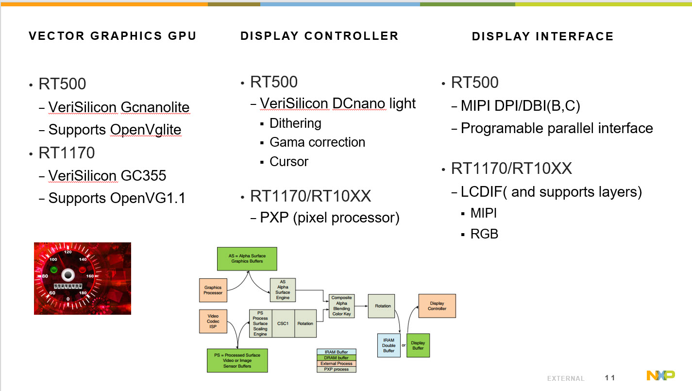
Vector Graphics GPU
- The RT500, which is going to be in the market in the next few months, has the VeriSilicon GCNanoLiteV which supports VGLite API.
- The RT1170, with its VeriSilicon GC355 supports OpenVG1.1
Display Controller
- The RT500, with its VeriSilicon DCNano, supports dithering, gamma correction and also has some cursor memory.
- The RT1170, with its PXP pixel processor, has many layers that we can composition. It does rotation as well, as well as provides different aspects of blending.
Display Interfaces
- RT500 supports MIPI DPI/DBI (B,C) and has a programable parallel interface
- RT1170 has an LCDIF (and supports layers), but does support still MIPI and also RGB interfaces.
Hardware architecture and graphics are complex
Besides having really great graphics engines in our parts, I think another really important factor is looking at the architecture of the subsystems, and how they can get access to memory. Graphics are very memory intensive hardware elements.
For example, in the RT500, we have five megabytes of unified internal memory, an M33, fusion DSP, and the GPU. They have complete access to this unified five megabytes of memory, and it's up to the user to decide how he wants to partition that memory. We can apply some to the frame buffers, and also we can expand that out into external memory using what we call FlexSPIs.
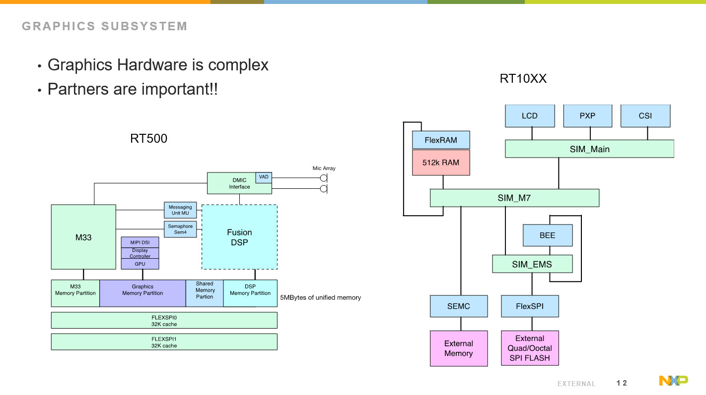
Those FlexSPIs can interface with NV memories like QuadSPI flashes or OctoSPI flashes double data rate and also PS RAMS and operate up to 200 megahertz double data rate. You can put your graphics assets and your frame buffers externally if you want to drive large displays. If you wanted to have internal smaller displays, internal memory works just fine. You have this option and flexibility with these parts to have significant memory externally, or a fair amount of memory internally to support your graphics asset. The other point I want to make about this is that we have direct access from the GPU into both the internal memory and the FlexIOs, and we avoid contention from the M33s or the DSPs.
We have full bandwidth to all those memory assets. The same goes for the RT4 digits, and this one I'm showing there's a PXP and an LCDIF, so that PXP is doing the compositioning and that can be done directly out of external memory. It can be done of internal memory, or it can be done out of these Quad or OctoSPI flashes. Then at the same time, the LCDIF can be rastering out of the different assets. You can modify or change how your system performs depending on your use case and to get optimal performance. You get those ideas of 60 frames per second. You have those memory assets to do that.
Trends in embedded graphics on IoT devices
with Jason Clarke, VP Sales and Marketing, Crank Software
If you're not familiar with us, Crank is an embedded GUI solutions company. We're built on many years of embedded engineering, and built our flagship GUI software tool, Storyboard, from the ground up exclusively for the embedded market.
Lately we've been winning a lot of awards from industry and from our partners and from press, about all the innovating things we're doing with graphics. If you're not familiar with Crank, you may have interfaced with one of our applications. In fact, many companies around the world are running touchscreens that were built with Storyboard and delivering user experiences you may remember. This is what we really focus on - helping our customers bring these rich interfaces to life that deliver brilliant experiences.
Our customers have designers, product teams, marketers, engineers - many individuals across their organization coming up with new ideas that leverage this new expectation of connectivity. Regardless of the industry where they sit, they need to bring a rich user interface to life as best they can, and it's not a unique problem. Before, rich graphical interfaces used to be limited to only industrial and medical devices, who typically had very archaic types of interaction.
Today however, everyone is looking to deliver the touchscreen experience that people expect to get on their iPhone or Android phones.
Embedded graphics designers should be thinking beyond the smartphone
When a customer touches a touchscreen, they have an expectation of how it's going to feel, how it's going to scroll. They don't have any awareness of the type of hardware that's underneath there, or the price points involved, or any of the technical decisions otherwise made. It's probably not a fair assumption, but it's one we have to live with, and one that can make a great impact on the performance of your embedded device. It's for this reason that we built our flagship product, embedded UI development platform, Storyboard.
Storyboard is a development environment that makes it faster and easier for design teams and engineering teams to work together and create a vision of a rich user interface on an embedded device.
Our customers use a variety of different hardware, it doesn't matter to us what they choose as we work with all of them. We help them leverage the inherent capabilities of these different platforms and show them how to make a GUI in a nice, easy fashion.
Because Storyboard runs on Mac, Linux, and Windows and can be used for development across multiple different backends, it's not restrictive and has immense scalability built right into every Storyboard application.
It can be used to develop embedded GUIs for MCUs, and all the way up to MPU. Right from the bottom of NXP's RT series, and even some of their older platforms, all the way up to their most complex multi-core, multi-GPU systems. In all cases, Storyboard can be used to leverage whatever backends behind it.
There's an experience expectation set out right from the beginning. All those rich interfaces consumers have touched before are your new baseline, but if you're making a fairly utilitarian photocopy machine, you may not want to put a giant GPU onto your product.
Fortunately, hardware technology is constantly evolving and new graphics technologies are coming out all the time. That said, it's often not feasible to compromise the price point so that a rich interface can be used in a situation where it's not necessary.
Companies are also trying to get to market as fast as they can with their new products in order to stay on top. It's a perfect storm there: high expectations, evolving hardware and technologies, and short timelines. There is alot of great opportunity, but there's hard work to come with it. The question is - how can we make it easier for our customers to deliver this touchscreen that really wows. This is really the big question.
It's here that Crank shines, as we help our customer's really take advantage of the capabilities of their hardware, and operate a maximum performance within the device's power and battery constraints.
Case Study Spotlight: rapid GUI prototyping in <30 days
A client of ours, Dometic, is focused on making outdoor living easier. As a luxury RV manufacturer, they wanted to enter a new, competitive marketplace with some new technology. We were fortunate in that they chose Storyboard to develop the GUI, on top of the NXP RT processor.
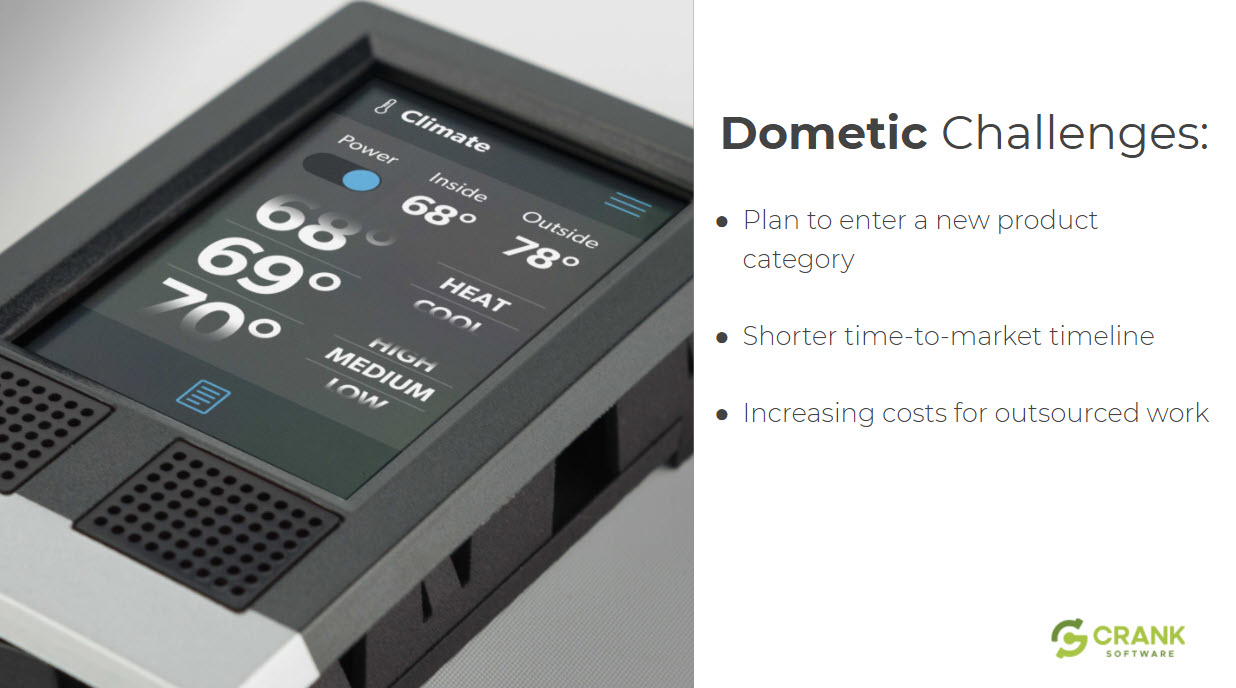
To put a long story short, they released the product on time, got to market in record time and saved a ton of money as a result of using the Storyboard platform.
If you're interested in touchscreens and RVs, I recommend you go to the Dometic website and read about the control panels inside these vehicles. The one we worked in was the Multiplex Interact, an IoT end-device with display that allows connectivity and controls multiple devices in the RV from climate control, lighting, water heater, pumps, etc. This device had to have mobile app connectivity, yet also needed to be able to work wi-fi less for when they were out in the middle of the wilderness.
They had a lot of unique problems, that spanned multiple devices that needed to be brought all together. When we started talking to them, had to bring a product together, and this is a new market for them. It's like many of our IoT edge device customers. It was new for them to add a display to their device before, but to keep pace with the market it was needed. This demonstration of innovation was pretty big, as they were looking to put displays on devices where up until now, it had been all just buttons and hard controls.
With the new display, they are able to give so much more feedback to the user. It gives a much richer look and feel, while providing more power and setting controls options to their customers.
Touchscreens on top of embedded systems wasn't their area of focus. They needed to make a solution that would get them to market fast. They needed to do it in a very short timeline, as they were feeling alot of competitive pressure. They were also aware of the costs they would incur if they outsourced this to other companies, and knew how expensive it would become with each iteration, especially considering how many devices and layers were involved.
Compounding this issue is also the added performance pressure. If performance is low, people can drain way too much time debugging issues, trying to sort out the problems. That can just crush your time to market.
It's here that Storyboard really helps. Getting you to market quickly is one of the most fundamental benefits of our solution. We accelerate development. We make it very fast and easy. We have a great workflow that helps our customers get to market faster.
We built the system understanding that embedded UIs require iteration of design. It was also built to be flexible to work across different hardware, allowing people to scale - whether it's across a product line or just inside their system, in order to take advantage of changing LCD views or resolutions.
Storyboard is built to also accelerate design. GUI designs are generally started in Photoshop or Sketch. With our easy import feature, we are able to pull that content directly in, animate and receive feedback almost immediately while pushing to test it on the hardware.
A lot of our competition talks about how they offer a "faster time to market"... Well, yes, everybody seems to be helping with this. Yes, using any tool is better than using nothing. However, I don't think people always fully understand the order of magnitude faster that we're talking about. In all of our demos and our videos, you can in real time just how fast we are talking. We can actually pull in Photoshop files, start adding behavior animations, connect screens quickly, build rich animations, and push it immediately to a target to see. All under five minutes!
That speed to target is so valuable, because until you see your UI running on the system it's going to run on. This can give you an appreciation for how it may look on the LCD you plan to use, and help you answer questions like:
- Do the animations I've created have the performance to run?
- Is the user experience what I think it is, because it's never until you actually touch it, that you really understand.
- What are the opinions and feelings of other stakeholders on their interaction with the demo?
With Storyboard, this comes really quickly - just from a simple Photoshop import.
Easy animations for every UI (including MCUs)
I have customers all the time who say, "My UI doesn't have animations." That's just not true - when they hit a button, something happens. When they hit a window, it slides in. Maybe it's not what they would classify as an amination, but it is. And it's these micro interaction that happens, those little pops that give a UI a rich feel.
You can do very small animations even on small MCUs, providing they aren't too taxing on the processor. If you have 2D optimization, animations are easy to do and eat up very little CPU. A lot of people are so worried that if they're on a small form factor, and believe they can't do animations because of memory, or because of CPU performance. But in fact, those small animations and the detail that designers can put into them, can make them feel rich.
In the old days, we used to just flip an image to go up and down. Somebody would hit a button, it would go up and then you go down, and you'd switch images. Now we put a little pop, like a little fade or alpha blend, with some additional subtlety added by the designer and it can deliver a rich feeling that's completely difference. These micro interactions can really make the difference and still be done at a very cost effective price point with a small MCU. You can control it and make sure that the animations run exactly.
An animation timeline tool is very powerful because if you want to have design teams and engineering teams working well together, you need to talk a language that's similar between them. For example, the design team may be using AfterFX, while the engineering team use code and syntax. When there's a mismatch, it's really hard for them to have a conversation together because they don't combine the two languages well.
With Storyboard's animation timeline, the designer can actually just sit down and tweak the animation themselves to make sure it's perfect and exactly as they want it to run. They can walk through the frames each step by step to make sure it's exactly what they want, rather than have the traditional long feedback cycle of going back and forth between design team and engineering team saying, "No, that's not quite it, no, a little slower, a little faster."
Design iteration doesn't have to be expensive
The next thing you have to deal with here is iterations on your design. But really what you're embracing is opinions.
Everybody has an opinion, and it's a given that you're going to get user feedback from different stakeholders throughout your company. This was a great quote from Dometic, "In the past, adding features to our UIs was time consuming and cost up to $100,000 per iteration. Now with Storyboard, we're able to add features more frequently and incorporate design feedback faster because of its design flexibility."
Design iteration can be expensive. It can be expensive for many reasons. It can be expensive because you're going back to the graphic designers. Design teams aren't always cost effective, engineering teams. Sometimes the design iterates enough that it causes the code to have to all be written again.
It can cause large gaps in getting to market. I've seen it so many times with the products we've worked on in the past, where a company take so long to actually see the UI on the device, that they're so close to the release date before somebody can actually provide user feedback. And then when they get the feedback, it could be so constructive. Yet, they're so close that they have to make a decision, either to delay the release of the product or just ignore the feedback. The easier route that most take is to release with a compromised solution.
Using compare and merge to identify change and update design files on the fly
Innovation with IoT edge devices today is moving so quickly, that it's important manufacturers remember not to lose focus on usability and UX experience. Within Storyboard, we have done so much work to accommodate this. We can import and re-import Photoshop files so that when you do go back to the design team and they make a bunch of changes, you don't have to start over. Simply reimport the new file, and do a compare emerge of the changes within the Photoshop file into your project, so it'll say, "Okay, these images have changed, these things have changed positions, these ones are new, or these ones have been removed."
You can actually merge in Photoshop changes in minutes, and require no rewriting of code. You just need to validate that your animations and everything still works exactly as expected. There might be some fine tuning if things changed large position wise, but for the most part, most of our customers are able to just bring in the new file.
With designers and engineers working together in the same software, you need to be able to compare and merge also impact the area where the engineering team is working, which is a code repository usually. Other systems use syntax. They say, "Oh, we push all our stuff. If they're a code generator, they generate all the code, and then the engineer merges that code." Well, if it's generated code, chances are the engineer doesn't always know exactly what that code's doing because it's the value of the tool. If they knew what it's doing, they wouldn't need the tool.
Using compare and merge to test the impact of the proposed change
With our compare and merge tool, we actually merge at the tree level of the architecture. When we import a Photoshop file, the architecture of our system still looks a lot like screens, layers, controls, etc. We actually merge that tree level. When somebody's doing a merge, they see the tree, they see what's changing, but even more powerful than that is they see a graphical representation of the two of them side by side.
For example, when you see a screen change black, people don't always realize that they changed an image and who it's affecting, and what it's causing on other screens. With Storyboard however, you can actually see what other screens might be affected by this change, and see the difference to make sure what you're doing is right. This means that somebody who's bit more of a visual person than a code person can actually make changes and commit them into the repository for the end engineers to work with, instead of just the design team telling the engineers what they would like to see happen, and then waiting a day to hear a response.
Make sure you can move your GUI to a different processor later
UI flexibility can mean a lot of things, but to us, we look at it as being able to go wherever you need to go with your solutions.
"New market opportunities have opened up for us as a result of being able to add functionality and innovate faster with Storyboard." was a quote from this customer Dometic. They wanted to move to a bigger processor to make a bigger screen, try new things, and add new features. We helped with those ideas and helped them do it quicker. You're able to actually leverage what you've done and move it forward faster.
We offer a scalable solution that goes across multiple platforms, hardware vendors, different software layers, whether you pick ones like QNX, Wind River, Green Hills, Linux, Android as your platform or the smaller ones like FreeRTOS and Toradex and such. We can leverage all of those, and we give you the ability to not have to worry about your GUI having to scale up or down. Maybe you have a series of products with a low, medium, and high end version, and maybe you'd like the low-end to be on the RT series. In the middle, maybe you have like a i.MX 6UL and at the high end, you have one of the brand new i.MX 8s with a GPU core to give that product line match.
Crete once in Storyboard and go everywhere you need to go after that. We can cover you completely wherever you're thinking you might have to go as your product scales up or down. The products change, but coming back to what Rob was talking about earlier, managing complexity is things. As he mentioned, the hardware vendors are giving more and more inside of what they can fit inside of that processor or MCU, MPU, and storyboard is going all these different ways. We can go up and down to match wherever you need to be. If you're going to be on a small processor and there's no optimization, we can just do software rendering. We can leverage the QSPI interfaces.
Save on image RAM space
Storyboard can also help you save on a lot of RAM space with your images and get up and running quickly. If there's 2D optimization on the NXP chain, they have a lot of different 2D technologies that are really powerful. We can leverage the G2D, the PXP pipeline, the VGLite. Hybrid rendering is something awesome that we did on the 7ULP, where they had G2D rendering and they had a 3D GPU, but the 3D GPU pulls more power. When there wasn't 3D content on screen, we could actually on the fly switch over to the 2D GPU and actually draw less power for those devices that need to be very power conscious, but still wanted to have the power of a 3D GPU.
Then as we keep going up, there is the 3D GPU multi-core. Storyboard can manage FBX files, 3D models, everything you would expect to have. It's a single tool that provides a chain all the way up and down for your system to manage. We take care of that complexity. A lot of that stuff where Rob was talking about, there's a VGLite and then there's the PXP, and then there's how you go to screen. We take care of all of that for you and it just becomes transparent.
Case study: moving from a 'software-render only' target to one with 3D optimization with ease
I recall a customer once who built an embedded GUI on a 'software-render' only possibility target, and then realised later they needed to switch to something that had a 2D optimization or 3D GPU. They made it work quickly and easily, by simply changing the version of Storyboard they were using. Their app worked exactly as intended, yet they were now able to leverage all the performance gains previously unavailable to them with the processor they were on.
That's all I wanted to cover today. I encourage you to visit the NXP site at the i.MX RT series link to find out more about their processors, and this compelling product line. The power that's coming out down there is one of the most exciting growth areas we're seeing today, because for a long time, MCUs were always seen as simple UIs.
.png?width=180&height=67&name=Crank-AMETEK-HZ-Rev%20(4).png)


