.png?width=180&height=67&name=Crank-AMETEK-HZ-Rev%20(4).png)


Working in the embedded development space as a GUI designer is definitely different than your typical GUI and UX development role. Understanding that the customer's UX is critical is still a core focus, however having a broader understanding of the way that the UI and UX is going to perform on the end target is necessary. Particularly as it impacts performance, which if poor, could kill your entire ideal UX vision.
In this blog post, the second part of a series on GUI and UX design for embedded systems (read part one here), we look at the benefits that a collaborative process can provide embedded teams, allowing them to work in the same space without bumping into one other. Crank's own Graphic Designer, Dan Conroy, highlights the things embedded UI designs should embrace, and the sidecuts that should not be taken when working on a GUI design that's bound for an embedded system.
How Storyboard helps maintain the integrity of your UX vision
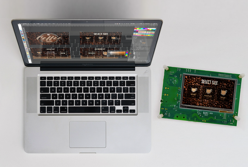
Storyboard was built on decades of GUI design and development experience where there's a strong separation between the front-end and back-end integration - the system logic. This enables a collaborative process for both designers and developers to work in the same space (using Sketch and Photoshop import) without bumping into each other while working. Speaking as a GUI designer, Storyboard leverages design teams where I think a lot of other solutions don't. They've got a greater seat at the table which can really help the creative process. We're an award-winning company, award-winning software, and a lot of our customers build products that are award-winning as well - which matters to us.
Storyboard was purpose-built to accelerate the design and development of modern GUI experiences for embedded devices. The neat thing is that the underlying hardware platform can be whatever the embedded product development team wants it to be, because in Storyboard, you develop once and can deploy everywhere - different hardware configurations, operating systems, and rendering technologies. That's how Crank Software got started.
Today, Storyboard is used in medical, industrial, smart home consumer and automotive sectors by companies that are winning product design awards like Red Dot Design and Editor’s Choice Awards. They're taking designs that led embedded devices to market faster and without ever compromising the user experience.
Consumer have expectations of your smart device
In terms of best practices when it comes to embedded, the context matters. Everything gets influenced by consumer expectations. To put simply, the touchscreen user interface should work the same way as a smartphone. We've all got them and we're all very used to them. But, now you see displays on multiple consumer products and want them to work the same way as your smartphone. The phones in our pockets can cost over one thousand dollars as top performance devices - but that's not necessarily the case for the products that we interact with.
Consumers are not ready to spend one thousand dollars on a touchscreen thermostat or a coffee machine. It's just not going to happen. But at the same time, they really want a machine that works smoothly for a positive user experience. That’s the challenge for embedded designers and developers.
You can read about the latest embedded GUI/UX trends in our post here.
Meeting embedded UI and UX designer expectations
Designers work in powerful tools every day to build out these embedded GUI graphics for products. And in a lot of these prototyping tools, the simulated applications more often than not will run on desktop, your web browser or your smartphone. These platforms have a lot of memory and a lot of processing power to be able to deliver what it is that a product team builds up, so there's an assumption for high performance. I think it is the role of design teams to present their impressive content but at the same time, applications can be very resource-demanding. There’s things like gesture interactions and 3D content, video and motion design and so on. That can be very taxing to an embedded system depending on what it's capable of.
To help with this expectation, Storyboard is scalable. As mentioned earlier, it can hit high level microprocessors down to low level MCUs, so you have this range of opportunity to bring in grand 3D GUI graphics or a lot of video content, down to very basic simple applications. The challenge is how do you achieve the absolute best performance you can in the configuration that you're working within?
Developing your embedded GUI: Storyboard do's and don'ts
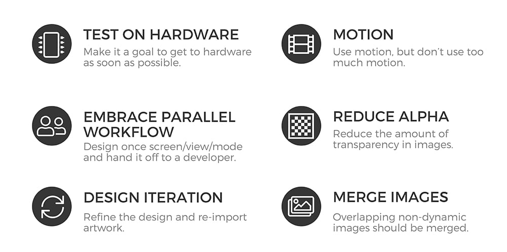
Do: Handoff GUI designs to the development team regularly
I would say what's most difficult for design teams from personal experience, is wanting to take a design and complete it entirely - and you can refine a design to perfection for a very long period of time. But it's more important to do a handoff, so that the development team isn't idle and waiting for GUI design artwork. What's difficult is the mentality. You’d think that once you've handed off your design that you're out of the picture and no longer have a seat at the table but that’s not really the case with Storyboard. Storyboard allows for multiple imports, so you can keep adding to your design as you go along. You're able to embrace a parallel workflow where the designer can go back to design and focus there while the development team builds out the rest of the GUI application.
Do: Make it a goal to test on hardware as soon as possible
I would always encourage any product development team starting out to make it a goal to test on hardware as soon as possible. And the reason for that, is that using the simulator in Storyboard or testing on your tablet works to get a good sense of the flow and interaction of your embedded GUI app, but when you get to the hardware, you're then testing at a very real level. This is how the product will perform and you're getting insight into what that's like. It gives the systems engineers some insight to how things are running in other areas that they can improve upon to refine and improve performance. And it's that improved performance that's going to improve the experience for your end user.
As a GUI designer, I find a lot of times that I design at a very zoomed in view because there's a tendency to create pixel perfect. But once you get to a display size and pixel density, maybe you want to rethink the size of an icon or something along those lines. So testing on a target is a very helpful, very useful way working through a project. And when you get to the end of your project - test, test, test some more.
Do: Play around with motion graphics
With motion graphics, it’s kind of like Goldilocks and The Three Bears - too hot, too cold, and just right. That's the same with motion and having it there for meaning. For example, you should merge images together if they’re overlapping and never independent from one another, you're then saving a file that doesn't need to be in the system. That's a gain that you get back. You’re really trying to squeeze every bit of performance out of your systems because you’re chasing after that smartphone experience with embedded hardware.
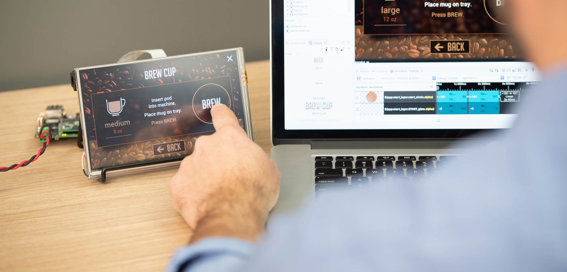
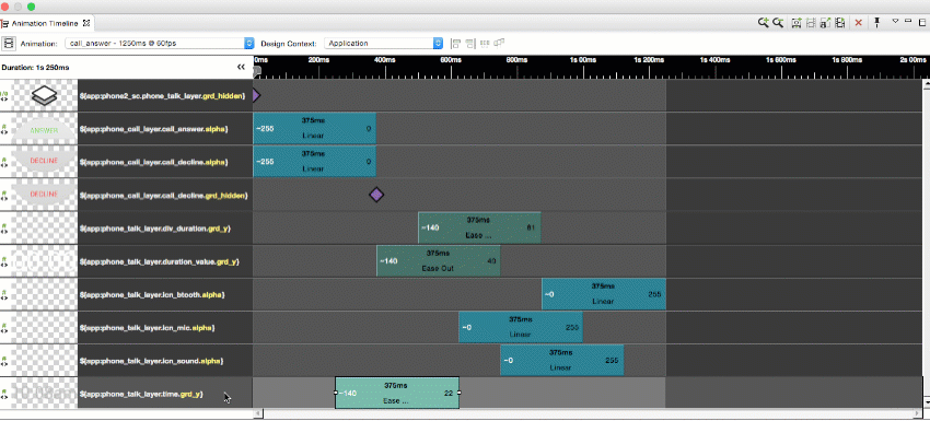
This is all just setting up to play around in Storyboard. In Storyboard, you have all of the assets and all of the structure that you’ve planned and created ahead of time - similar to your design tools that you’re already comfortable working in. Then, you're just starting to add the behavioral functionality to it in order to build out your embedded application.
Do: Add events and actions to create animations and movement
To start, I could have a screen fade that takes me to my weather screen in my thermostat application. When I finish, that action has now been added to a button. What’s really convenient is that I can copy that action and move it over to the settings button too. And so now, with that same action being applied, I could just change where it's being pointed to. One is going to go to my setting screen and the same action is taking us back to our home screen as well. That's really quick work to just start adding events, actions and behaviors into your embedded project.
To sign off in part two of our Hello World blog series, Fresh Consulting has a couple touchscreen best practices for embedded GUI and UX designers to consider in creating their own projects. I hope this has helped you kickoff or re-energize your UX journey in embedded applications.
Touchscreen UX design best practices from Fresh Consulting
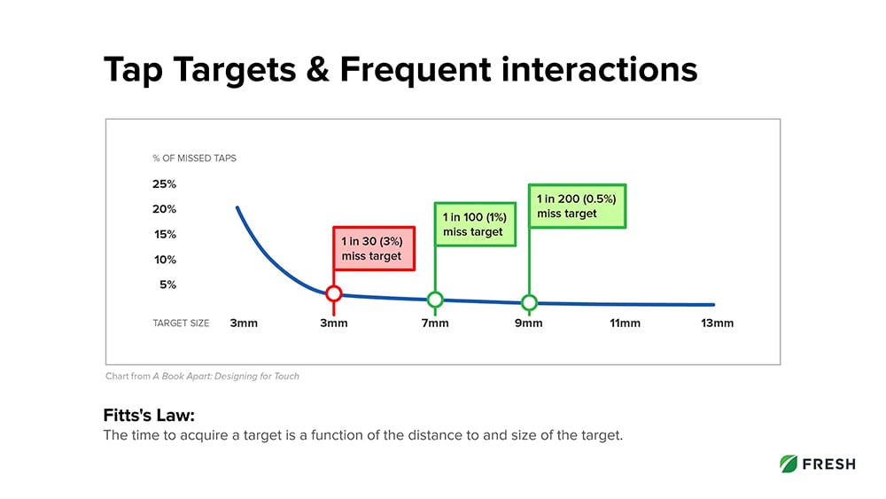
1. Tap Area Size
People have different sized fingers so our friends at Fresh Consulting decided 9+ millimeters is a good standard to start with and that's going to depend on how many pixels you put into the tap area of buttons. It’s going to depend on the pixel density of your screen to determine how many pixels actually gets the physical size of the button up to 9 millimeters.
For example, you’ll see on this chart that you could get away with 7 millimeters but it's pretty small and you're going to get some more missed targets. You’ll also get diminishing returns as you get to 13 millimeters and above. Sometimes, just because of design and hierarchy, you might want the button to not be so big and that's okay. Visually, you can actually just make it smaller than the minimum tap areas as long as the tap area around it is up to that tap area size. As long as there’s spacing around it to make it clickable, then you’re all set.
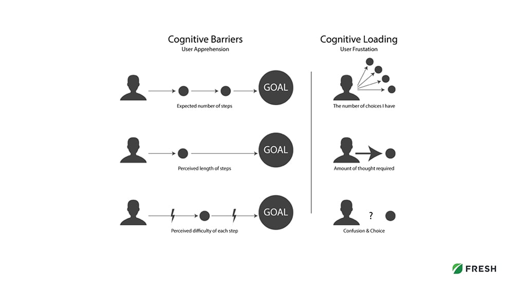
2. Icons
A large interaction problem is when people don't use icons appropriately. The main reason is because most icons are not universally recognized and usually require a label. If icons cause too much thinking from the user’s end, then you increase that cognitive load in decision, and overall don’t create a great experience. Long story short, people get frustrated if they have to think too much when there's too many choices. You really want to avoid that.
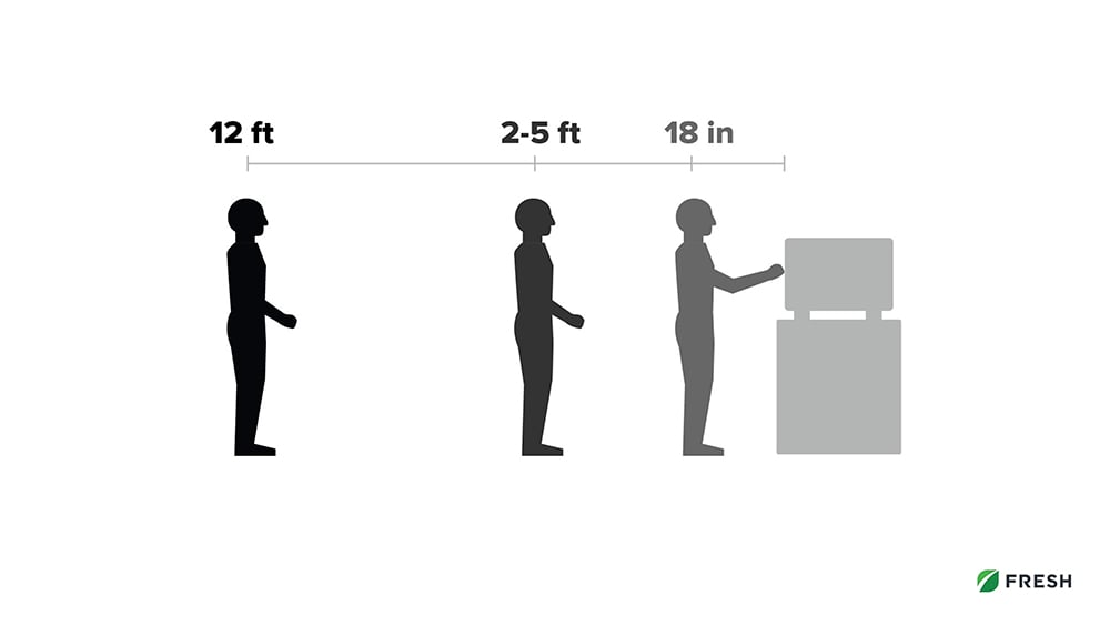
3. Visual Hierarchy
Base your visual hierarchy of your designs on what users need to see from different distances or the specific actions needed for the specific flows. Not every action has the same priority, so you want to consider that. For the restaurant products that we also looked at in Part 1, Fresh Consulting compared what users were doing when they're up on the screen versus what they might need to see from a few feet away - or even across the room. An example of what they did in one of our modules or components was creating a cook timer where from across the room you can see the progress and time. But as you get closer, you can read the actual item or recipe that's cooking. And right up front, there's a clickable stop button to cancel that cook.
4. System Feedback
You want to provide system feedback to confirm and inform actions. What that means is creating a two-way communication between the user and the system to confirm that the actions were actually done. An example of this is press states on buttons showing a keyboard or if you click on a letter that it's going to create a press state. You can see that you actually made contact with the machine and it's entered.
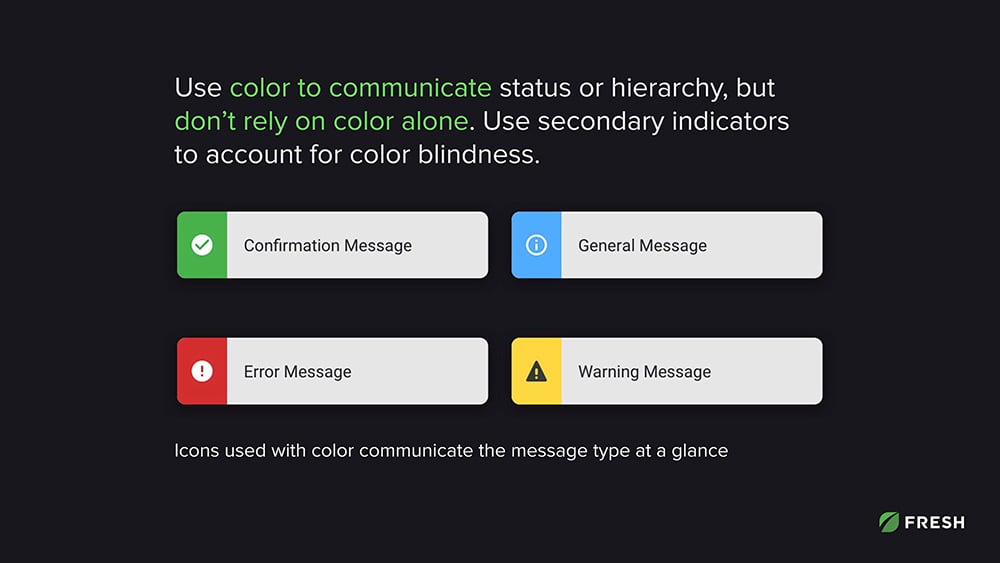
5. Color
Color should have meaning. Color should be used to communicate status or hierarchy. The trick is to not rely on color alone. Use secondary indicators to account for color blindness. For example, Fresh Consulting used a little message in the image below. The small message system created allowed different kinds of messages, some urgent and some just confirming you did something well. The green color combined with the check mark or the red color combined with the exclamation point are included. At a glance, the user can quickly know what the message was about and if there's any urgency behind it.
6. Animation
A lot of times, animation is just quick little transitions that help smooth out jumping from one state to the next rather than being abrupt and jumpy - and maybe losing where you were before. It’s important to animate for usability and not just flair. For example, the accordion menu is very helpful to have those subtle transitions from open states to close states. Although these kinds of animations are a quarter of a second, maybe a half second at the most, they create a much better, smoother experience.