Bring UX, architecture, and resource optimization to the forefront when building and validating your applications
Smartwatches and other types of wearable devices present big opportunities to offer new products to customers, and put unique challenges onto application developers. While Apple’s watch OS and Google’s Wear OS dominate the marketplace, there are options to deliver similar experiences that don’t require costly hardware and cumbersome operating system stacks (see Zepp Health's Amazfit smartwatches). Microprocessor (MPU) and microcontroller (MCU) platforms give developers the CPU and graphics power to build sophisticated smartwatch user experiences (UX) while also consuming less power and reducing procurement costs.
Developing apps for MPUs and MCUs is different from building with the Apple or Android environments as you’re working closer to the hardware and have more control over operating system, memory, graphics, and CPU workloads. Before starting the development and testing of your next MPU/MCU-based smartwatch, it’s important to understand these differences.
How to develop a smartwatch application
Aside from price, consumers base their smartwatch purchasing decisions on features and battery life. To target these aspects effectively, developers need to understand how to best define their application architecture, user experience, and optimization techniques for memory, graphics, and power efficiency.
Application architecture
In general, it’s best to decouple the graphical user interface (GUI) logic from the system or backend logic, as it keeps the front-end isolated from any churn or changes in hardware or peripherals. To do so, you must adopt some form of glue logic, or communication pattern, that moves data back and forth between the system model and the GUI model.
Whatever your glue logic approach, it's critical that your smartwatch UI design development framework supports a clear and maintainable separation between the front-end and back-end. Too often, developers hope to achieve better performance on MPU/MCU platforms by sacrificing a clean architecture in favor of bundling everything together into a monolithic app. This leads to development and maintenance issues, as small changes require big efforts to implement and test.
User experience
Smartwatch usability and UX aren’t the same as they are for phones and tablets. There’s less screen real estate and less room for power-intensive GUI elements like videos and animations.
This blog covers the top UX considerations for smartwatches, including screen size, CPU capabilities, and power efficiency.
Optimization techniques
Getting the most out of the smartwatch interface design platform’s capabilities requires understanding how memory and graphics work together. On first glance, a high-resolution image may provide the ideal UX but it could also require expensive CPU cycles and RAM space to decode and push to the screen. Similarly, a small animation effect between screen transitions may delight the user but it could also take up memory that you don’t have to spare.
Here are some blogs we’ve written to learn more about these concepts, and ways to determine which options for memory and graphics are right for you:
- Memory optimization considerations for embedded GUIs
- Optimizing image graphic memory in embedded GUIs
- Maintaining a responsive GUI with task prioritization
How to test smartwatch apps
Smartwatch testing is always about validating the user experience. Whether its functionality, performance, or battery life, your test strategy should consider these three things from the perspective of the user:
- Is the logic of the functional operation correct?
- Is the presentation to the user correct?
- s power efficiency within acceptable limits?
A logic test might verify that a button press or push notification causes a menu to pop up. A presentation test would further verify that all elements of the menu are visible to the user at specific (x,y) coordinates on the screen, rather than obscured by other GUI elements. Power efficiency testing may include measuring maximum, average, and worst-case consumption for specific CPU utilizations.

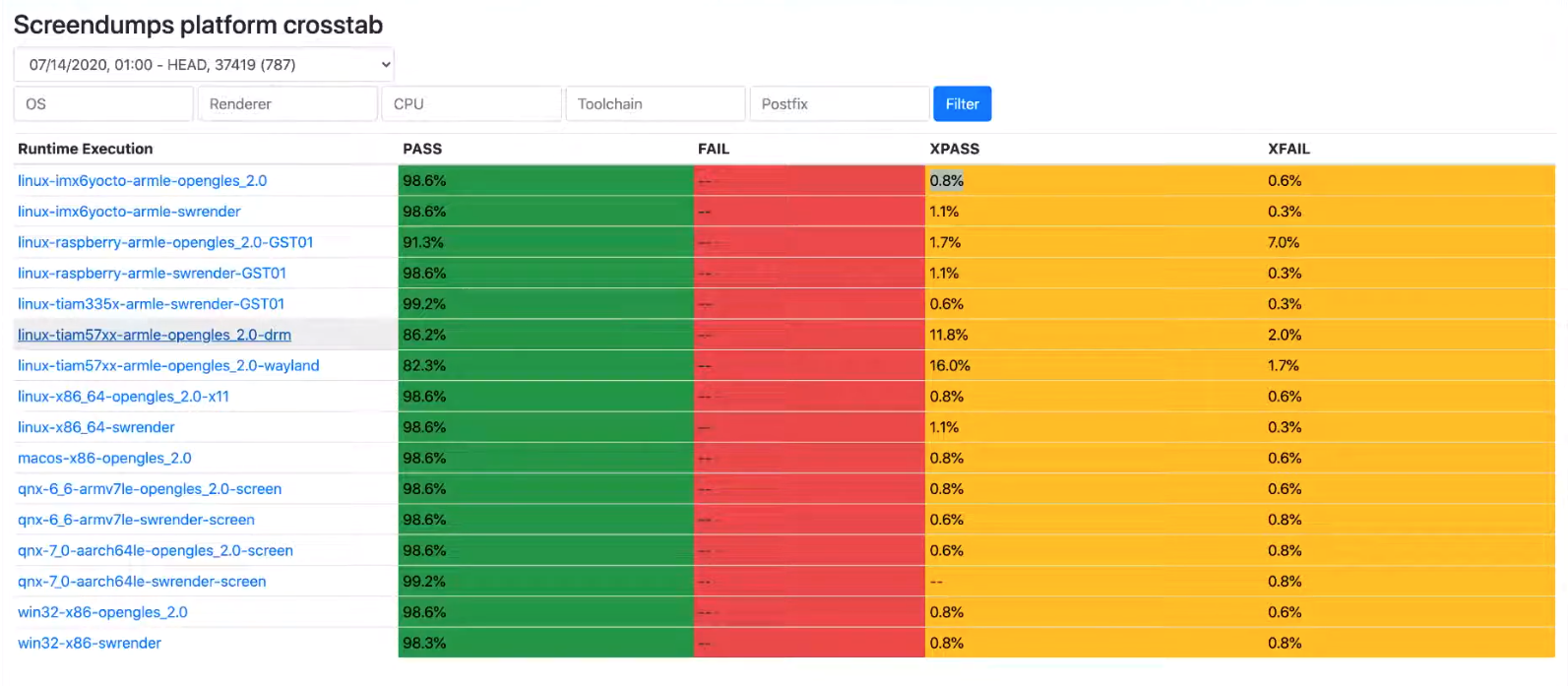
Example of GUI test results from our own Storyboard development team
Testing smartwatch GUIs is different from regular application testing as the device form factor tends to be smaller and there are fewer buttons (some designs have no buttons at all). Perhaps the biggest challenge is finding software function points or APIs to attach test harnesses to, and this is where simulation of the interface between the GUI and backend system is critical.
Through a robust GUI simulation mechanism, you can test both logic and presentation without requiring hardware. Not only does this free up testing resources, it helps find and resolve issues earlier in the development cycle.
Choosing smartwatch hardware
Based on the above concepts, smartwatch developers typically have three areas to consider when deciding which hardware platform to use:
- Is the platform powerful enough to run the GUI?
- Does the system have the memory it needs?
- What are the overall storage requirements?
As this is a lengthy topic on its own, we encourage you to read our hardware selection guide for in-depth details on choosing the right processor for your smartwatch development.
Creating and testing smartwatch apps for MPU/MCU platforms requires different tactics than your typical piece of software. When it comes to achieving the best UX possible, hardware capabilities must drive your GUI design and development decisions, while also adding new categories like power efficiency and memory usage to your test strategy.
We’re here to help and this webinar with NXP gives you an in-depth overview of hardware considerations and development tips for your smartwatch GUI projects:
.png?width=180&height=67&name=Crank-AMETEK-HZ-Rev%20(4).png)


